Project Brief:
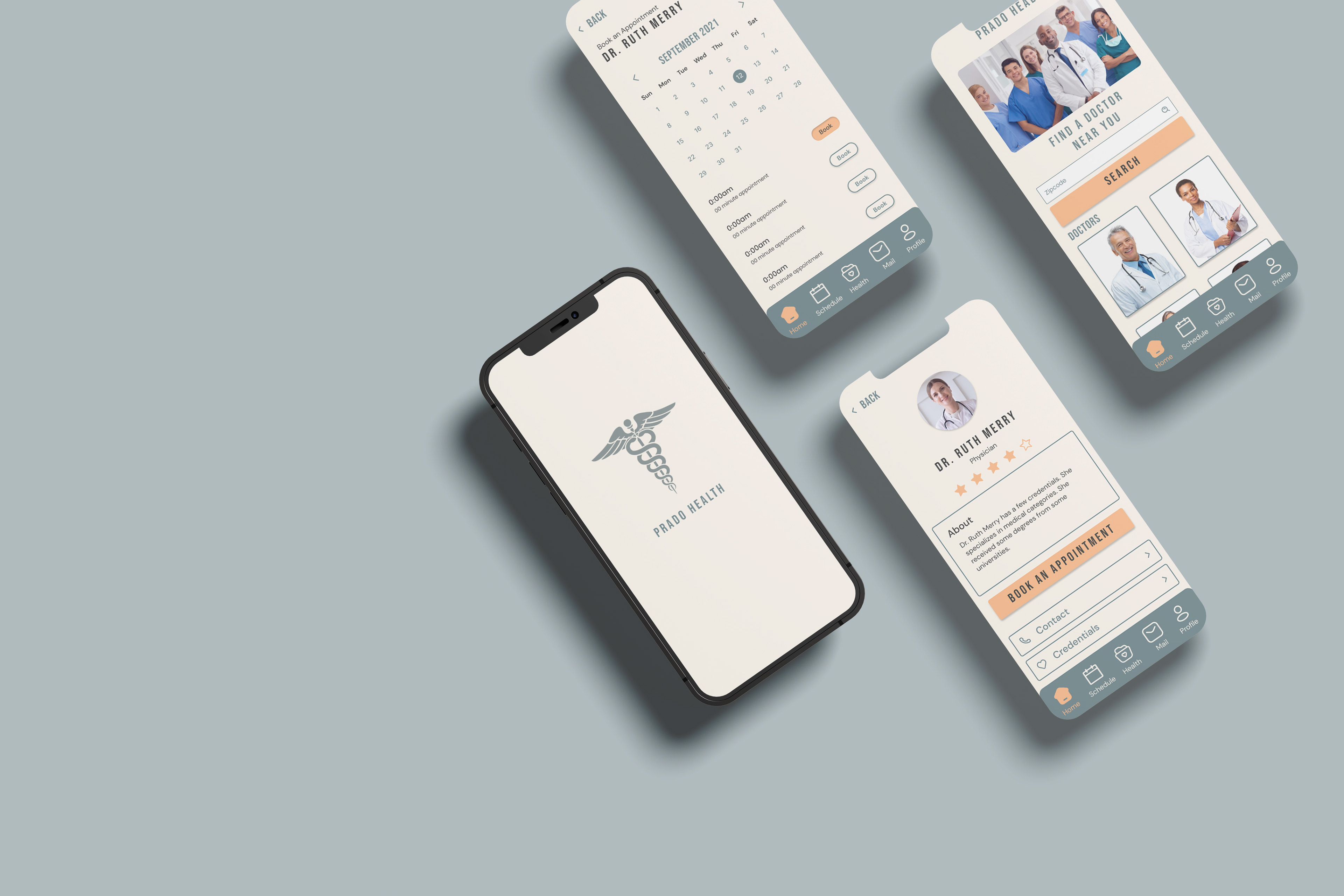
Prado Health, a fictional startup, aims to simplify and eliminate the stress associated with visiting the doctor. Their app is designed to make users feel comfortable and at ease, rather than feeling sick or confined to a hospital setting. Prado Health is developing a mobile app that enables users to search for doctors in their vicinity and schedule appointments. As the UI designer, my responsibility was to create high-fidelity mockups by establishing a standardized style guide to ensure a cohesive and visually appealing final product.
Team & Role: UI Designers
Timeline: 1 week (April 2022)
Tools: Figma, Adobe Illustrator, Adobe Photoshop, and Google Slides
Challenge:
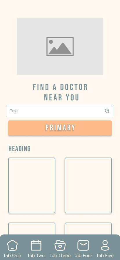
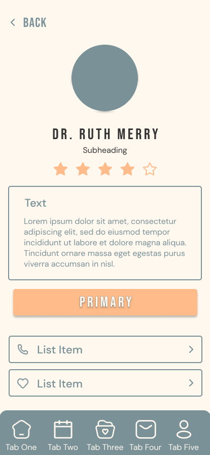
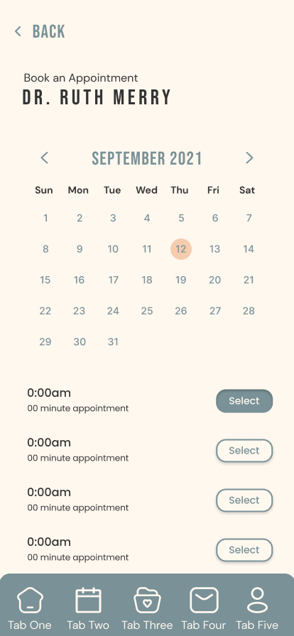
Prado Health aims to create a user-friendly and welcoming experience for its app users, avoiding the feeling of being sick or in a hospital setting. The app’s primary function is to assist customers in searching for doctors in their area and scheduling appointments.
The UX designer has entrusted the UI design team with the task of creating high-fidelity mockups. This involves applying stylized content and UI patterns to the existing wireframes. However, Prado Health’s design system is currently incomplete. While it includes a pattern library, it only contains a collection of gray-scale UI design patterns.
To address this, the UI design team needs to implement and add UI patterns to the wireframes. Additionally, they should select a color palette and typography that align with the standardized style guide. Once these elements are in place, the UI pattern library and wireframes should be applied with the standardized style guide to ensure consistency and visual appeal.
Approach:
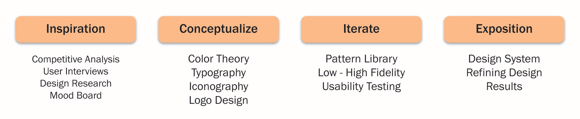
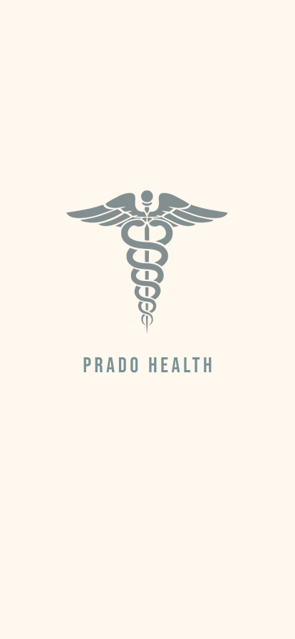
To tackle the task, I wanted to implement a variety of design methods to create a style guide that could be used as a standardized guide. In order to create a style guide, I incorporated design methods and ideas like color theory, typography, Iconography, and logo design.
Competitive Analysis:
Like many health-focused applications, this design aims to convey a sense of reassurance and positivity, reinforcing the feeling that users are making meaningful steps toward healthier choices. The intention is to create an experience that not only encourages proactive healthcare engagement but also ensures the process remains simple, approachable, and free of unnecessary stress. While visiting a medical professional is not always perceived as an easy or comfortable task, the primary objective is to reduce anxiety by providing an interface that feels calm, intuitive, and supportive.
In examining how other appointment-scheduling applications operate, a common pattern emerges in their visual design. Many utilize color palettes inspired by elements found in nature, such as blues reminiscent of the sky and ocean or yellows reflective of sunlight and flowers. These colors are often associated with feelings of tranquility, optimism, and trust, which help establish an emotional connection with users and contribute to a more comforting and welcoming user experience.
User Interview:
To assist with creating a color palette, I conducted a user interview that consisted of one question,
"What do you think of when the word 'serene' comes to mind?"
I wanted to ask this single question to receive a wider range of answers as this question can be perceived differently from person to person.
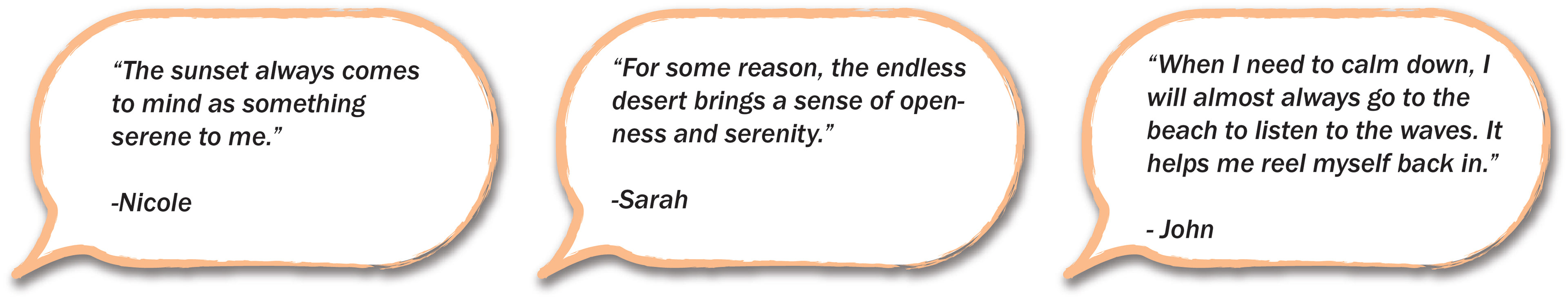
Design Research:
“Blue calls to mind feelings of calmness or serenity. It is often described as peaceful, tranquil, secure, and orderly.”
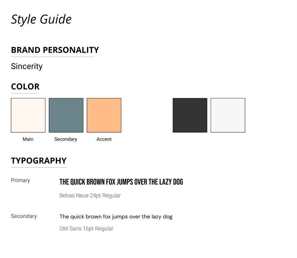
With the idea of color theory in mind, I wanted to apply the Color Psychology of Blue. According to the article by Kendra Cherry backed by Amy Morin, LCSW, the color blue is often found in nature such as the sky or the ocean which perhaps leads people to feel that blue is calming and serene.
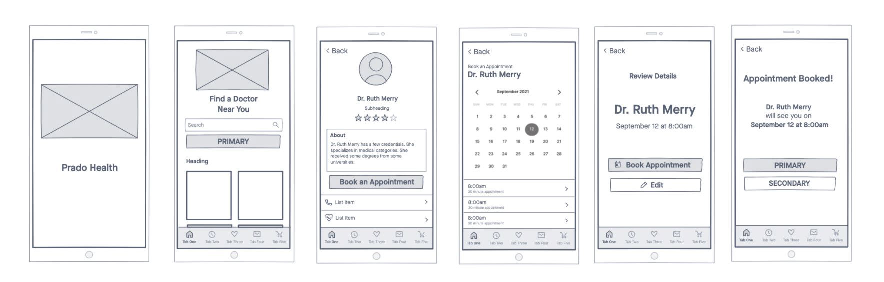
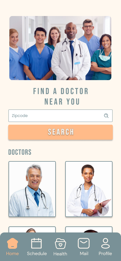
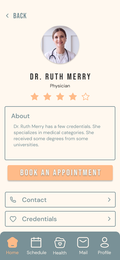
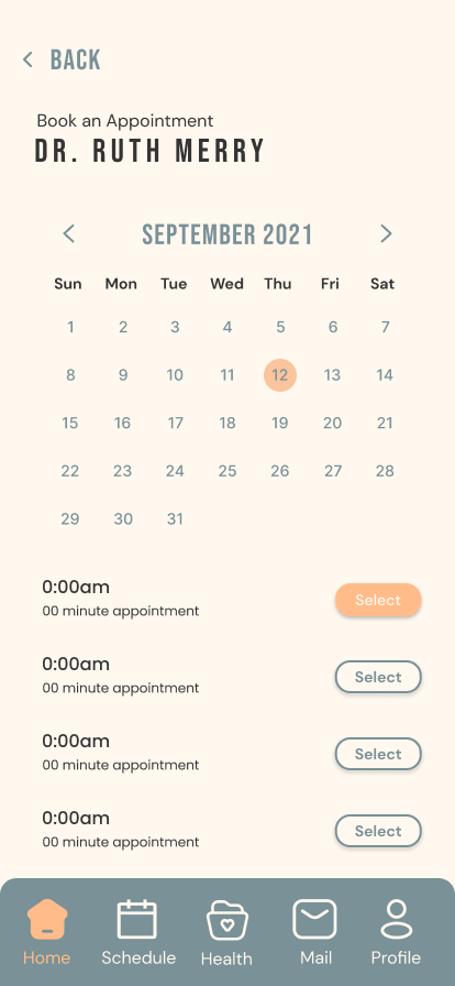
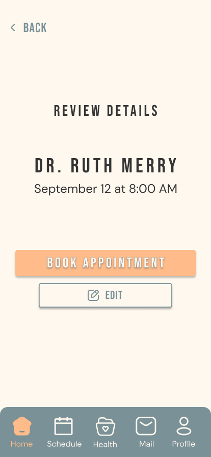
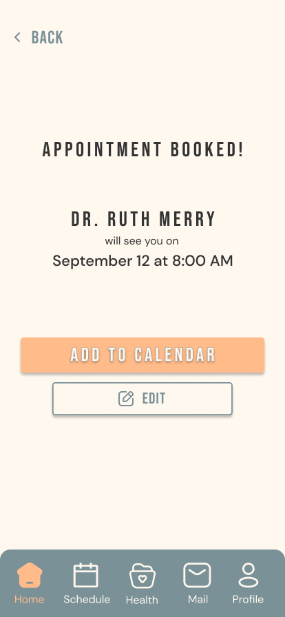
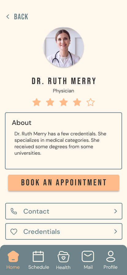
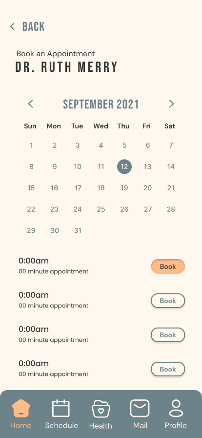
Mid-Fidelity Wireframes
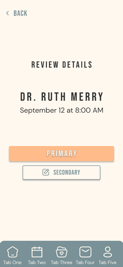
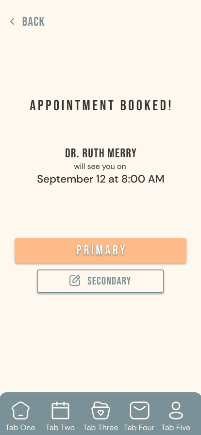
High Fidelity Wireframes
Usability Testing:
After testing the readability and visual design choices of a variety of test users, I was able to determine the biggest issues mentioned from the usability test:
- Secondary color does not have a readable contrast from the background.
- Labels within the buttons is not as clear.
- Circle from the calendar doesn’t feel prominent enough.
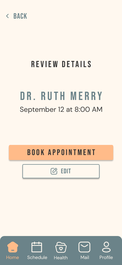
Usability Testing: Iteration
The objective is to ensure that users can read and navigate the application with optimal ease. In response to issues identified during usability testing, refinements were implemented to enhance visual contrast between interface elements.
Specifically, a dark grey color, as discussed in our color theory study, was applied to the buttons to achieve greater contrast between the foreground and background of each component. These changes improve overall readability and facilitate a more intuitive navigation experience.
Refining Design
Next Steps:
Although I possess a solid understanding of how to implement visual elements and color effectively, there is a clear need to further refine these design decisions to better support accessibility for users with visual impairments. Future iterations would focus on conducting a more thorough analysis of high-contrast text options, ensuring that typography meets established accessibility standards for legibility and visibility.
Additionally, greater attention would be given to the relationship between foreground and background colors, examining how variations in contrast ratios impact readability across different visual conditions. This process would include the evaluation and integration of accessibility features such as adjustable contrast settings, scalable text options, and alternative color schemes to accommodate a wider range of user needs, ultimately contributing to a more inclusive and user-centered design.